Sacred Geometry
Sacred Geometry as Quiet Structure
Geometry should not scream that it is sacred. It should hold proportion, rhythm, and orientation so the brand feels coherent before the viewer knows why.
Sacred Geometry
Geometry should not scream that it is sacred. It should hold proportion, rhythm, and orientation so the brand feels coherent before the viewer knows why.
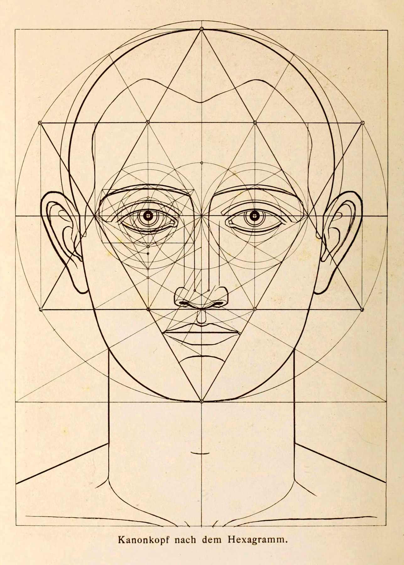
Sacred geometry is often treated as visible ornament: circles, triangles, grids, symbols placed on top of a design to make it feel meaningful. That is the shallow use. The stronger use is quieter.
Geometry becomes powerful when it controls proportion. It decides how a mark breathes, how a page opens, how a card relates to the next one, and where the eye should rest. The viewer does not need to recognize the structure. They only need to feel that the form is held.
A brand world needs rules. Without rules, every asset becomes a new decision and the identity starts to drift. A geometric system gives the work a set of invisible agreements: spacing, symmetry, tension, repetition, scale, and alignment.
The result is not cold. Done well, it creates relief. The page feels like it belongs to itself.
The studio uses geometry as a constraint before it uses it as a motif. A vesica, axis, triangle, square, orbit, or grid only appears when it is carrying the central pattern. Otherwise it stays underneath as scaffolding.
This is why the best symbolic work often feels simple. The complexity has already been resolved inside the system.